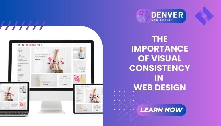
In the world of web design, visual consistency is a cornerstone of creating an engaging and professional website. It involves the harmonious use of design elements such as colors, fonts, layouts, and imagery across a website to maintain a unified appearance. Adhering to best practices in web design, including visual consistency, not only enhances the user experience but also strengthens brand identity.
At Web Design Denver, we understand the pivotal role consistency plays in building websites that captivate and convert.
What is Visual Consistency in Web Design?
Visual consistency refers to the uniformity of design elements throughout a website. This means that colors, typography, icons, buttons, and layouts follow a cohesive style guide to create a seamless experience for users. A visually consistent website reduces confusion, improves navigation, and fosters trust by presenting a polished and professional appearance.
Elements that contribute to visual consistency include:
- Typography: Consistent font choices and sizes for headings, body text, and captions.
- Color Scheme: Using a well-defined palette that aligns with the brand identity.
- Spacing and Alignment: Uniform margins, padding, and grid systems for layouts.
- Button Styles: Maintaining consistent shapes, colors, and hover effects.
This approach ensures that users can navigate your site intuitively while enjoying a cohesive aesthetic experience.
Why is Visual Consistency Essential for Your Website?
- Enhances User Experience (UX)
A visually consistent website provides clarity and predictability, allowing users to focus on content rather than navigating an unfamiliar interface. Clear visual patterns simplify the user journey, contributing to better engagement and retention.
- Builds Brand Recognition
Your website is often the first point of contact with potential customers. A cohesive design reinforces your brand identity, making it instantly recognizable. By adhering to consistent visuals, your audience will associate the design elements with your brand across platforms.
- Improves Accessibility
Consistency aids in accessibility, as users with visual impairments or cognitive challenges can more easily navigate a website with predictable patterns. For example, consistent button styles make it easier to identify clickable elements.
- Boosts SEO Performance
Visual consistency indirectly impacts SEO for websites by improving user engagement metrics like time on site and reducing bounce rates. Search engines value websites that provide seamless user experiences.
Key Features of Visual Consistency
- Unified Color Palette
A defined color scheme establishes harmony across all pages. Use primary colors for dominant elements and secondary colors for accents. - Typography Hierarchy
Define font styles for headings, subheadings, and body text to maintain a structured look. Choose no more than two complementary fonts for a clean design. - Reusable Components
Design reusable elements like buttons, cards, and icons to ensure uniformity across pages. - Consistent Imagery
Use high-quality images that follow a similar style, tone, and aspect ratio. This ensures a professional appearance. - Grid-Based Layouts
Implement a grid system to organize content effectively, creating balanced spacing and alignment.
Best Practices for Visual Consistency
- Develop a Style Guide: Create a comprehensive design system that defines colors, fonts, spacing, and component styles.
- Leverage Templates: Use consistent templates for pages like blogs, product listings, and contact forms.
- Test Across Devices: Ensure your website maintains consistency on desktops, tablets, and smartphones using responsive web design principles.
- Stick to Brand Guidelines: Align your website design with your brand’s visual identity for a cohesive experience.
- Iterate and Update: Regularly audit your site to address inconsistencies and improve user experience.
Common Mistakes to Avoid
- Overusing Design Elements
Avoid using too many colors, fonts, or layouts, as it can overwhelm users and detract from the experience. - Inconsistent Button Styles
Buttons with varying colors or shapes across pages can confuse users. Stick to a single style for CTAs. - Neglecting Mobile Consistency
Failing to ensure consistency on mobile devices can alienate a significant portion of your audience. - Unbalanced Spacing
Uneven margins and padding create a cluttered and unprofessional look. - Ignoring Accessibility Standards
Neglecting to use of accessible color contrasts or alt text for images limits usability for all users.
Conclusion: Key Takeaways
Visual consistency is more than an aesthetic choice It’s a fundamental principle of effective web design. By ensuring that your website elements align harmoniously, you enhance user experience, strengthen brand identity, and improve overall engagement.
At Web Design Denver, we specialize in creating visually consistent websites that are not only stunning but also functional. Contact us today to learn how we can help bring cohesion and professionalism to your web design.


